Artist David Hockney is an eccentric painter who has been shaking up the art world since his arrival in the Los Angeles art scene during the 1960s. His most notable paintings would be those featuring his iconic swimming pools, which made a big splash in pop culture. His most famous painting, Portrait of an Artist (Pool with Two Figures), was sold at auction in 2018 for $90.3 million, which broke the record for the most expensive artwork by a living artist sold at auction. He was a huge contributor to the Pop Art movement, which saw artists such as Andy Warhol, Roy Lichtenstein and Keith Haring challenge the traditions of the fine art world by integrating pop culture into their works. Throughout his long and successful career, Hockney has dabbled in other forms of expression such as photography, printmaking and what we'll focus on today: stage design.
Hockney’s sets are, in effect, colorful and bold paintings brought to life in three dimensions, transporting audiences to worlds that they could only visit in their wildest dreams. We’ve been lucky enough to have staged two of Hockney’s productions to date, with a third to come when Turandot opens in May. But before you're transported to Hockney’s take on Puccini’s final masterpiece, let's see what makes his opera sets so fantastical.
Tristan und Isolde
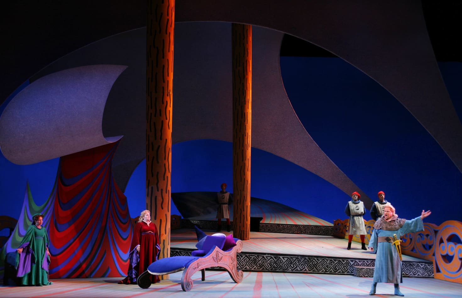
Hockney’s stage designs for Wagner’s Tristan und Isolde hold a special place in our hearts, as this production was commissioned for our second season in 1987. Hockney’s vision for Wagner’s masterpiece places a greater emphasis on open space than some of his other sets, with breathtaking yet existential scenery for the heartbreaking love story. If there’s one thing you need to know about Hockney, it’s that he loves his primary colors, and his designs for this opera have an emphasis on blue. Tristan is costumed in blue too, which emphasizes the melancholic mood the hero is in throughout the story. The extensive use of blue helps other colors stand out, such as the red costume worn by Isolde that signifies the passionate love between the two.
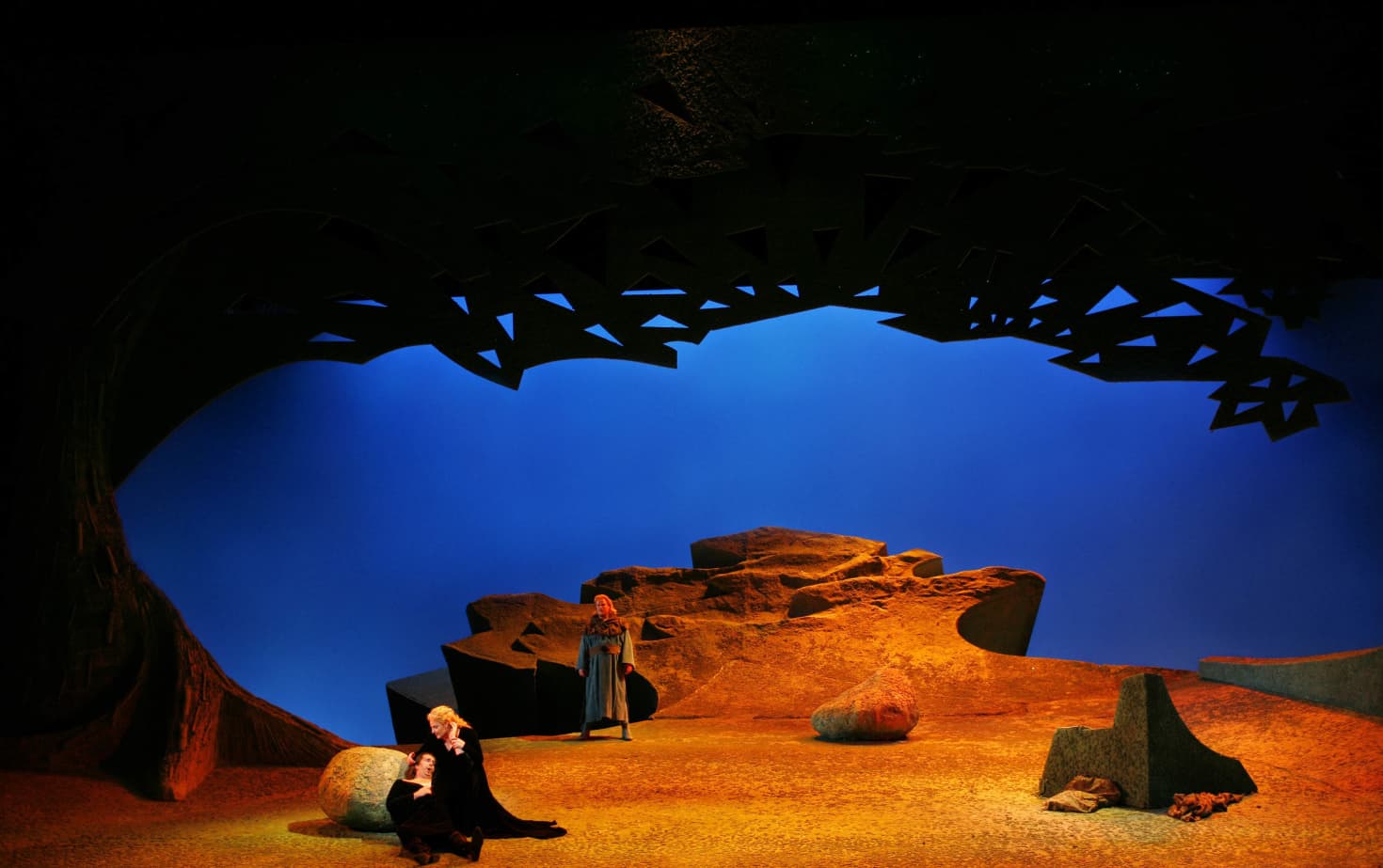
Hockney’s mastery of color isn’t the only thing he carries over from his painting background. His command of perspective can also be felt here. Hockney uses forced perspective in his sets, which is a technique that makes objects appear farther or closer away than they actually are. What’s particularly interesting is how he uses forced perspective to lead the eye into the empty spaces. This can be seen in the photo above; the edge of the cliff appears far away, leading into a wide-open blue sky. The positioning of it in the middle helps create the stage equivalent to peering over the edge to the abyss, reinforcing that existential feeling mentioned above while also filling a deceivingly simple looking set with a layer of complexity that can only be achieved by an artist as talented as Hockney.
Die Frau ohne Schatten
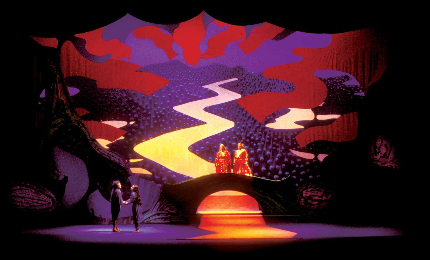
Five years after designing Tristan und Isolde, Hockney would give us his take on Richard Strauss’s fantasy opera, Die Frau ohne Schatten (The Woman without a Shadow). Where Tristan und Isolde can be described as Hockney in minimalist mode, Die Frau shows him as a maximalist; he fills the stage with vibrant patterns and implements textures. One of the most striking elements of the design involves the orbs embedded in the scenery, as shown in the background of the photo below, creating an eye-catching albeit alienating landscape. This lends itself quite well to Strauss’s whirlwind of an opera, transporting audiences to a fairy-tale kingdom that doesn’t quite resemble anything you’d see on this planet. Blue is still the prevalent color, but Hockney introduces red at key moments, giving the opera a wide palette (appropriately so, since one of the main characters is a fabric dyer by profession). If you’re looking for otherworldly opera sets, this is the one to take special note of.
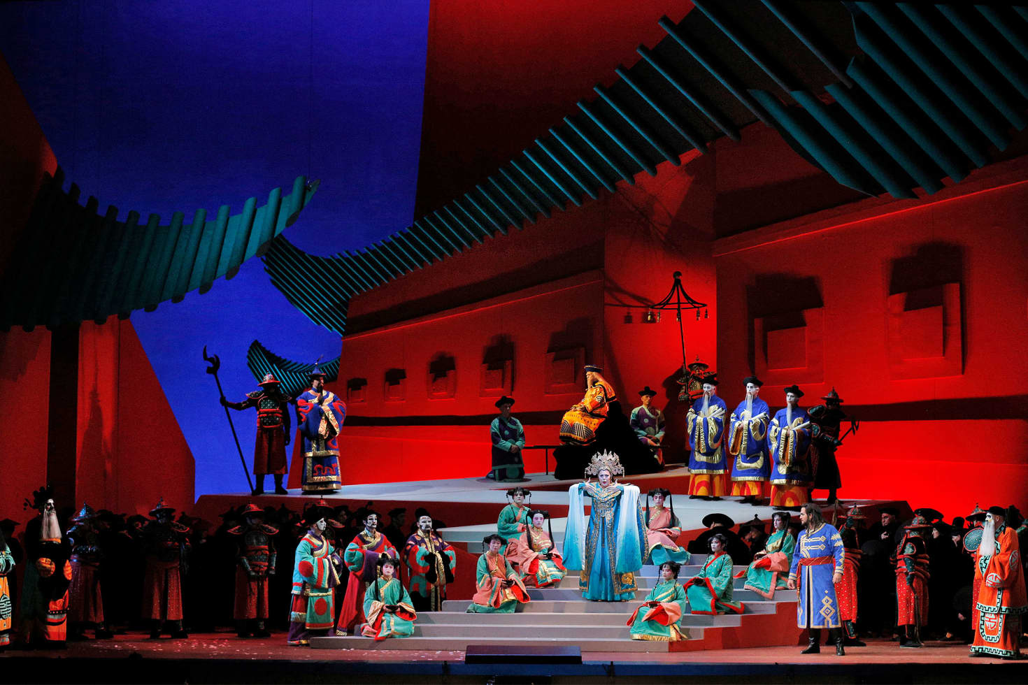
Turandot
And now for the Hockney set about to be seen in Los Angeles for the first time. His stage designs for Turandot showcase all the grandeur you’d expect for this epic opera while offering a fresh take that isn't like any other Turandot out there. First seen in 1991 at Lyric Opera of Chicago, Hockney’s Turandot is another demonstration of his mastery of color and perspective. It has a blue background like Tristan und Isolde, but red is what really takes center stage. Hockney also adds splashes of other vibrant colors to draw the audience's attention to important moments and lights the stage in a way that allows the textures of the set to stand out.
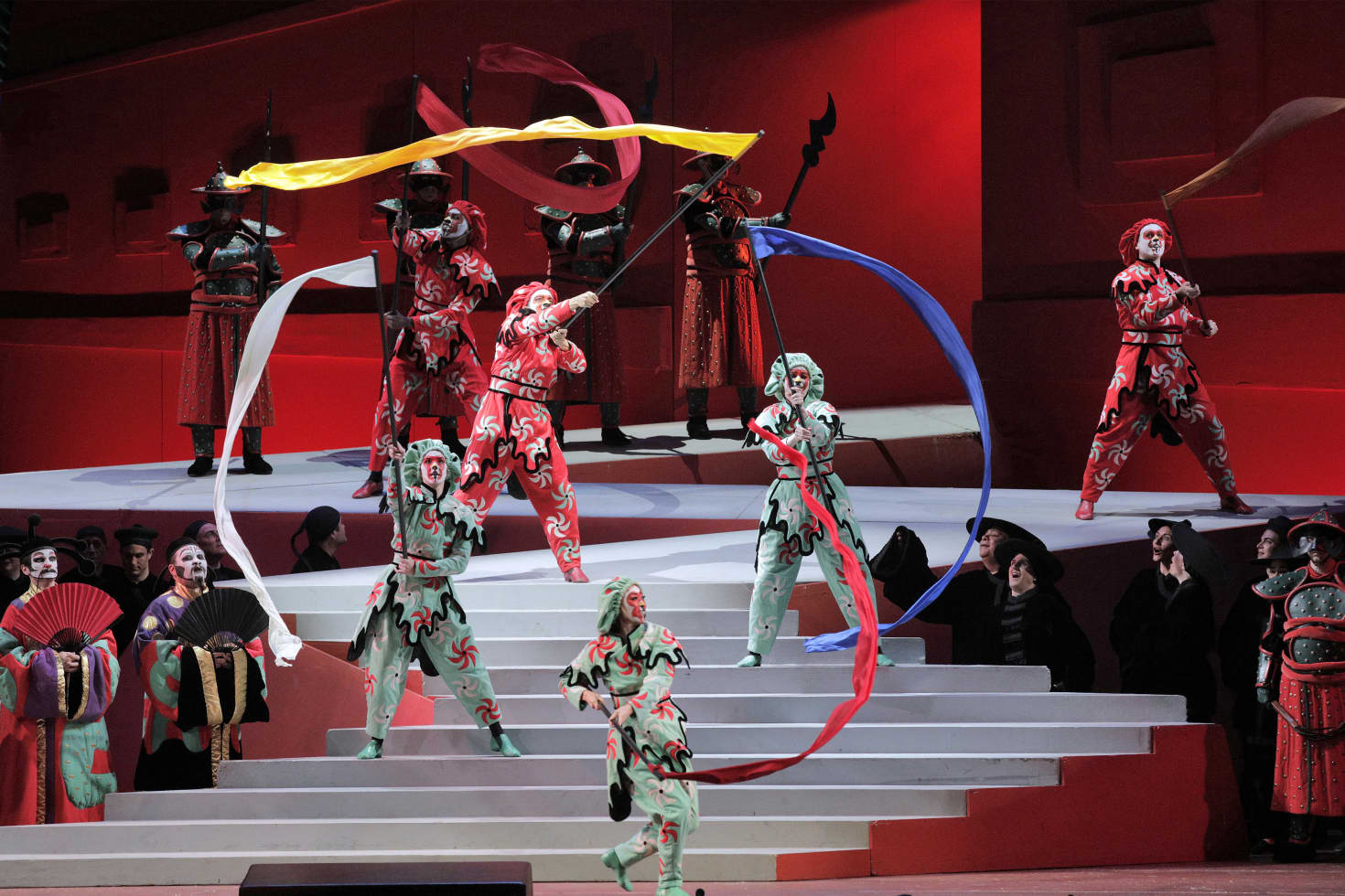
The perspective he gives to the imperial palace is jaw dropping. Opera stages are already big, but Hockney truly makes it feel like there’s a whole kingdom on display in front of us. He employs his skill at forced perspective and allows the sets to continue offstage, past what the audience sees. This creates the illusion of a grand fortress that we’re only seeing a small fracture of. Couple this with the bold and expressionistic shapes found throughout the design, and you have a visual spectacle that feels both familiar and boldly surprising.
We couldn't be more excited about having a third Hockney opera in our repertoire. If you haven’t had the pleasure of seeing one of his astonishing productions in person, then you won’t want to miss the chance to be transported into a world of wonder when Turandot arrives in May.